How Can We Help You?
Please provide a few details below and we will respond to you as soon as possible.
Please provide a few details below and we will respond to you as soon as possible.

Colour is one of the most powerful communication tools a business has, yet it is often underestimated when it comes to the exterior of a building. While interior design, branding, and digital presence receive careful attention, the façade is the first physical interaction customers have with a business. Its colour sets expectations long before someone steps through the door. With stable weather continuing across much of the UK and refurbishment activity increasing, this is an ideal moment for businesses to consider how exterior colour influences perception, behaviour, and brand identity.
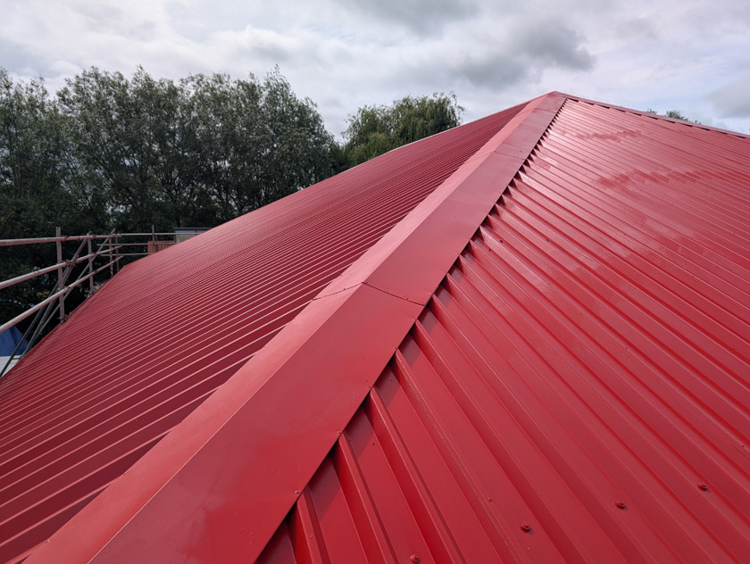
The psychology of colour has long been studied in marketing and design. Different colours evoke different emotional responses, and these responses can shape how customers feel about a brand. A building finished in a clean, modern colour scheme communicates professionalism and care. A faded or inconsistent façade can unintentionally suggest neglect, even if the business inside is thriving. In competitive retail environments, where footfall is rising and customers are becoming more selective, the exterior appearance of a unit can be the deciding factor between someone entering or walking past.

Colour also plays a significant role in brand consistency. Many businesses invest heavily in creating a cohesive visual identity across websites, packaging, uniforms, and signage. Yet the building itself is often overlooked, despite being one of the most prominent brand touchpoints. When the exterior colour aligns with the brand palette, it reinforces recognition and trust. For national retailers, this consistency is essential. For independent businesses, it helps establish a clear identity and stand out in busy high streets or retail parks.
Different colours communicate different messages, and these associations can be used strategically. Blue is often linked with trust, reliability, and calm, making it a popular choice for professional services and corporate environments. Red is energetic and attention‑grabbing, frequently used by brands that want to create urgency or excitement. Grey has become a modern, neutral favourite for industrial units and contemporary retail parks, offering a clean backdrop that suits a wide range of tenants. Black conveys luxury and sophistication, often chosen by high‑end retailers and boutique brands. Green suggests sustainability, freshness, and wellbeing, aligning well with eco‑focused businesses or those in health and lifestyle sectors. White offers simplicity and brightness, creating a fresh, open feel that works well for minimalist or modern brands.
Blue – Trust, reliability, calm
Popular for banks, corporate offices, and professional services.
Red – Energy, urgency, attention
Effective for fast‑paced retail environments or brands wanting to stand out.
Grey – Modern, neutral, understated
A common choice for industrial units and contemporary retail parks.
Black – Luxury, sophistication, premium quality
Frequently used by high‑end retailers and boutique brands.
Green – Sustainability, freshness, wellbeing
Ideal for eco‑focused brands, garden centres, and health‑related businesses.
White – Cleanliness, simplicity, openness
Works well for minimalist brands and businesses wanting a fresh, bright exterior.
These associations are not rigid rules, but they provide a useful framework for businesses considering a refurbishment. The key is selecting a colour that aligns with the brand’s values and the expectations of its customers. A gym might choose bold, energetic colours to reflect activity and motivation. A spa or wellness centre may prefer calming tones. A technology retailer might opt for sleek, modern shades that suggest innovation. The exterior should support the story the brand wants to tell.
In 2026, colour choice is more relevant than ever. Retail footfall has been rising, and many businesses are investing in their physical spaces to attract customers and remain competitive. High street regeneration continues to be a major topic in UK news, with local authorities encouraging improvements to vacant or ageing units to support economic recovery. Commercial landlords are increasingly refurbishing exteriors to secure new tenants, recognising that a modern façade can significantly increase interest. At the same time, sustainability remains a priority across the construction sector. Refurbishment through onsite spraying and cladding coatings offers a lower‑waste alternative to full replacement, aligning with environmental goals while delivering a fresh, modern appearance.

Modern onsite spraying plays an important role in bringing colour psychology into practice. It allows businesses to update their exterior quickly and efficiently, achieving a uniform finish across large areas without the disruption of replacing cladding. High‑performance coatings ensure the colour remains vibrant and resistant to weathering, which is essential for maintaining a professional appearance over time. With the current spell of good weather providing ideal conditions for curing and adhesion, many businesses are taking advantage of this window to refresh their exteriors.
Ultimately, colour is more than an aesthetic choice. It is a strategic tool that shapes how customers perceive a business before they even step inside. A well‑considered exterior colour scheme can enhance brand identity, attract footfall, and create a positive first impression. As refurbishment activity continues across the UK and businesses look for ways to stand out, understanding the psychology of colour offers a valuable advantage. A building’s exterior is a canvas, and the right colour can transform not just how it looks, but how it is experienced.

Colour is one of the most powerful communication tools a business has, yet it is often underestimated when it comes to the exterior of a building. While interior design, branding, and digital presence receive careful attention, the façade is the…